Apple Music Rebrand 2026: More Than Just a New Logo

Why Apple’s new identity may signal a bigger shift in its strategy as YouTube Music closes the gap.
The bitten apple woke up one morning and decided San Francisco was getting boring… Kidding. Kind of Apple?!
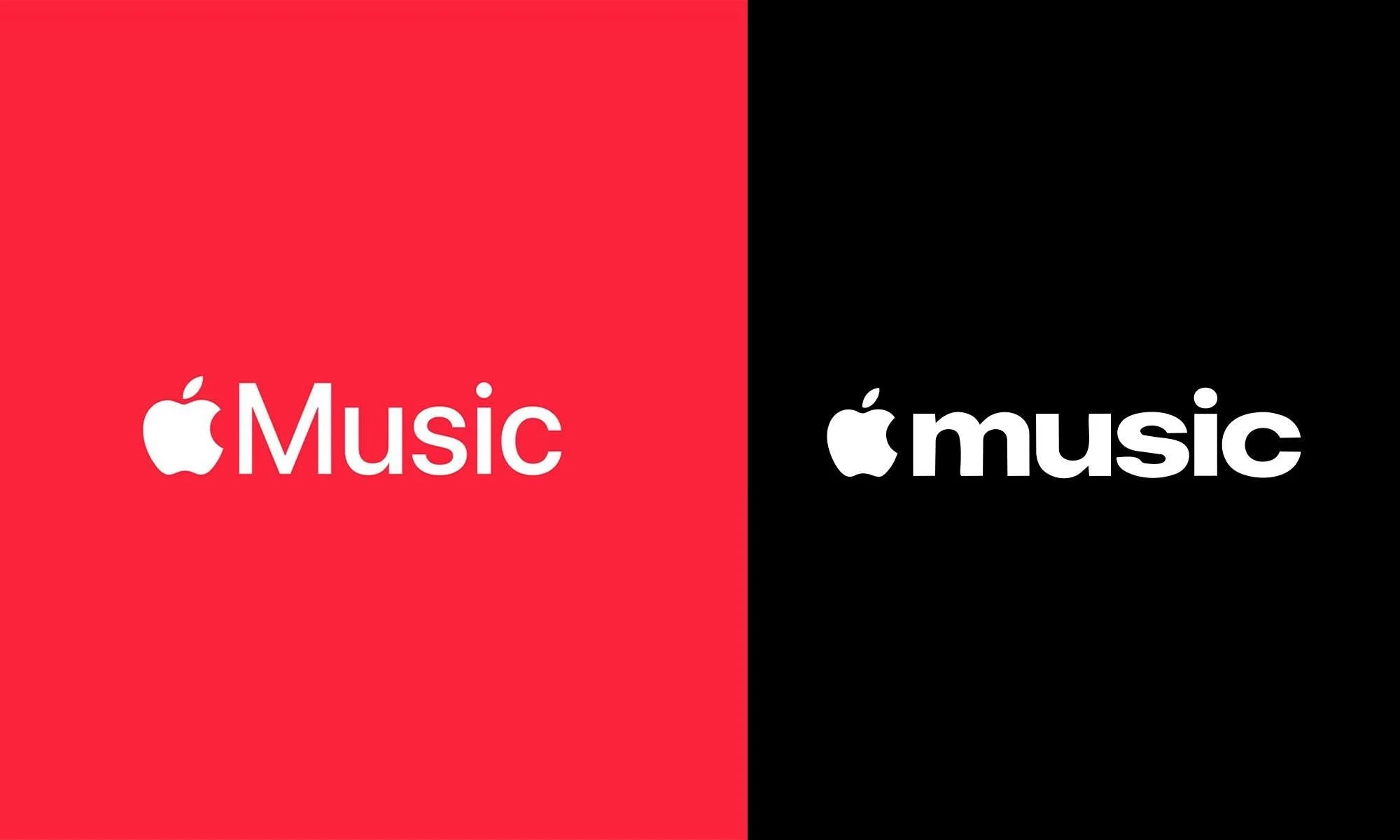
Jokes aside, the Apple Music identity change looks visually simple, but I think it says a lot strategically.
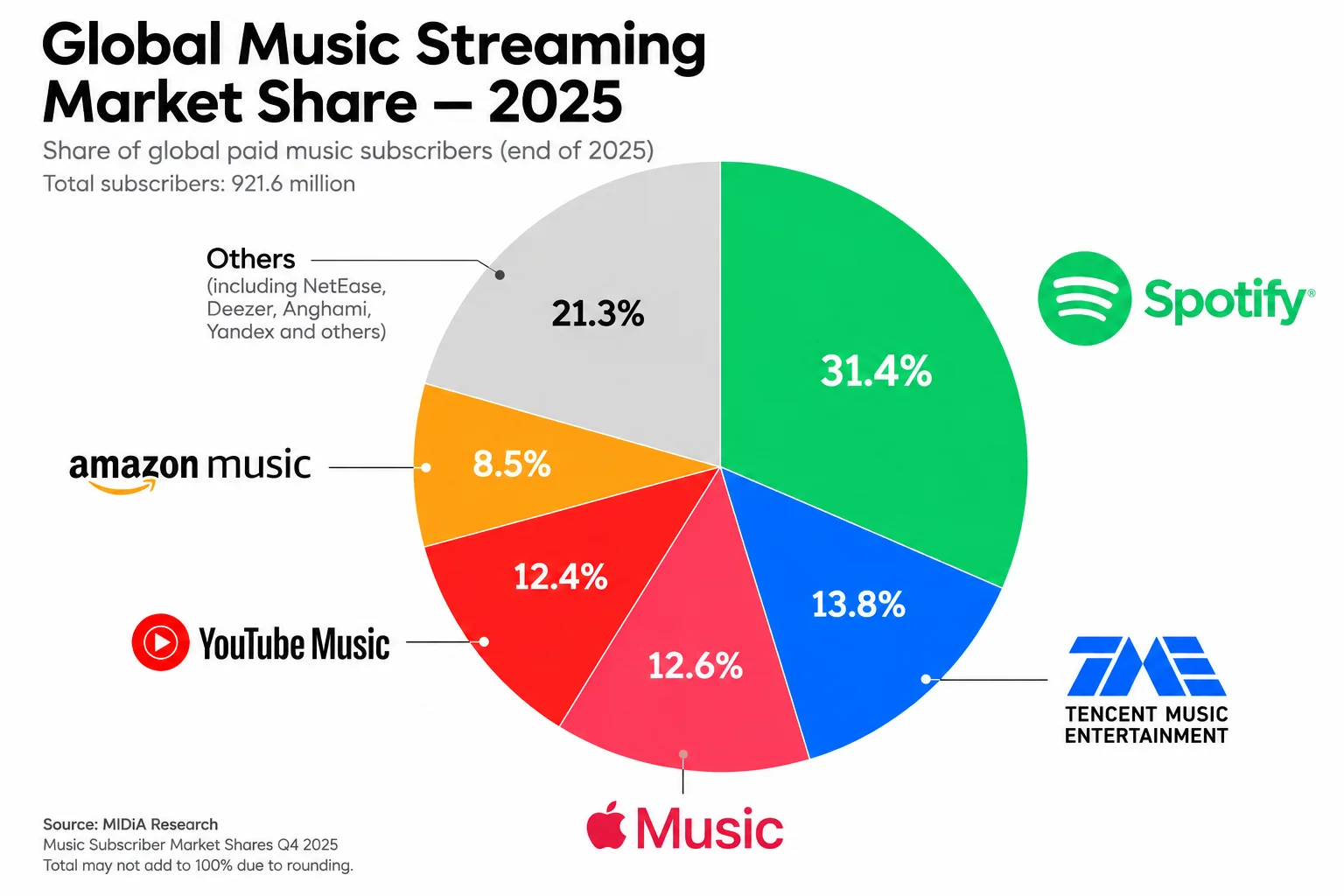
Five years ago, Apple Music was comfortably the second-largest music streaming platform. Today, Spotify still leads, Apple Music and Tencent are close, while YouTube Music grew from around 8% market share in 2020 to 12.4% in 2025 — almost matching Apple Music at 12.6%. MIDiA even expects YouTube Music to overtake Apple and Tencent during 2026.
And this is where the rebrand starts making sense.For years, Apple had a very clear formula: Apple + Name = Apple Service.
It works incredibly well inside the Apple ecosystem. But it also makes Apple Music feel more like a service provided by Apple than an independent music brand with its own cultural identity.
The new wordmark starts breaking that formula: heavier and more condensed typography, lowercase instead of the capital M, and an overall personality that feels less corporate and more cultural. It follows a broader direction we've also seen from competitors like Spotify.
What makes this more interesting is the timing.
The new identity appeared alongside Apple Music Hall in London, Apple's first physical venue dedicated to Apple Music, with live performances, recording and production studios, and Spatial Audio facilities.
That suggests Apple wants Music to exist beyond the streaming app and become more present in music culture itself: artists, live experiences, content and community.
We're seeing hints inside the product too. With iOS 27, Apple redesigned artist pages and introduced artist logos, giving musicians much more space to express their own identities and add their logos within Apple Music and personally I'm expecting a bigger makeover for the communication behind Apple Music.
So to me, this isn't simply:“They changed the font.” It could be the beginning of a bigger transition:
Apple service → Music & cultural brand.
And the timing matters when YouTube Music is growing rapidly through something Apple can't easily replicate: the entire YouTube ecosystem of video, Shorts, discovery and YouTube Premium.
The new identity hasn't rolled out everywhere yet, so I'm more interested in what comes next.
If Apple follows the visual change with a broader shift in the Apple Music experience and marketing, then the bold typography may have just been the first signal.
Was this helpful?
Your reaction is anonymous