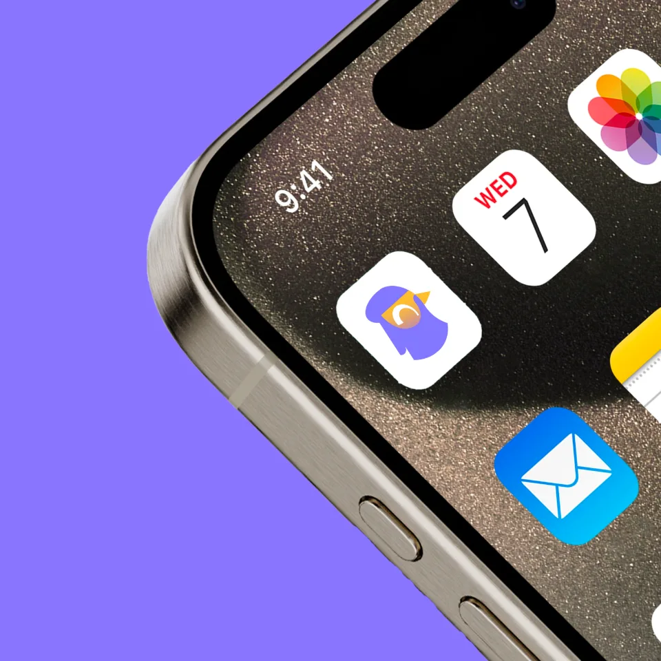
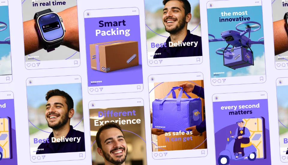
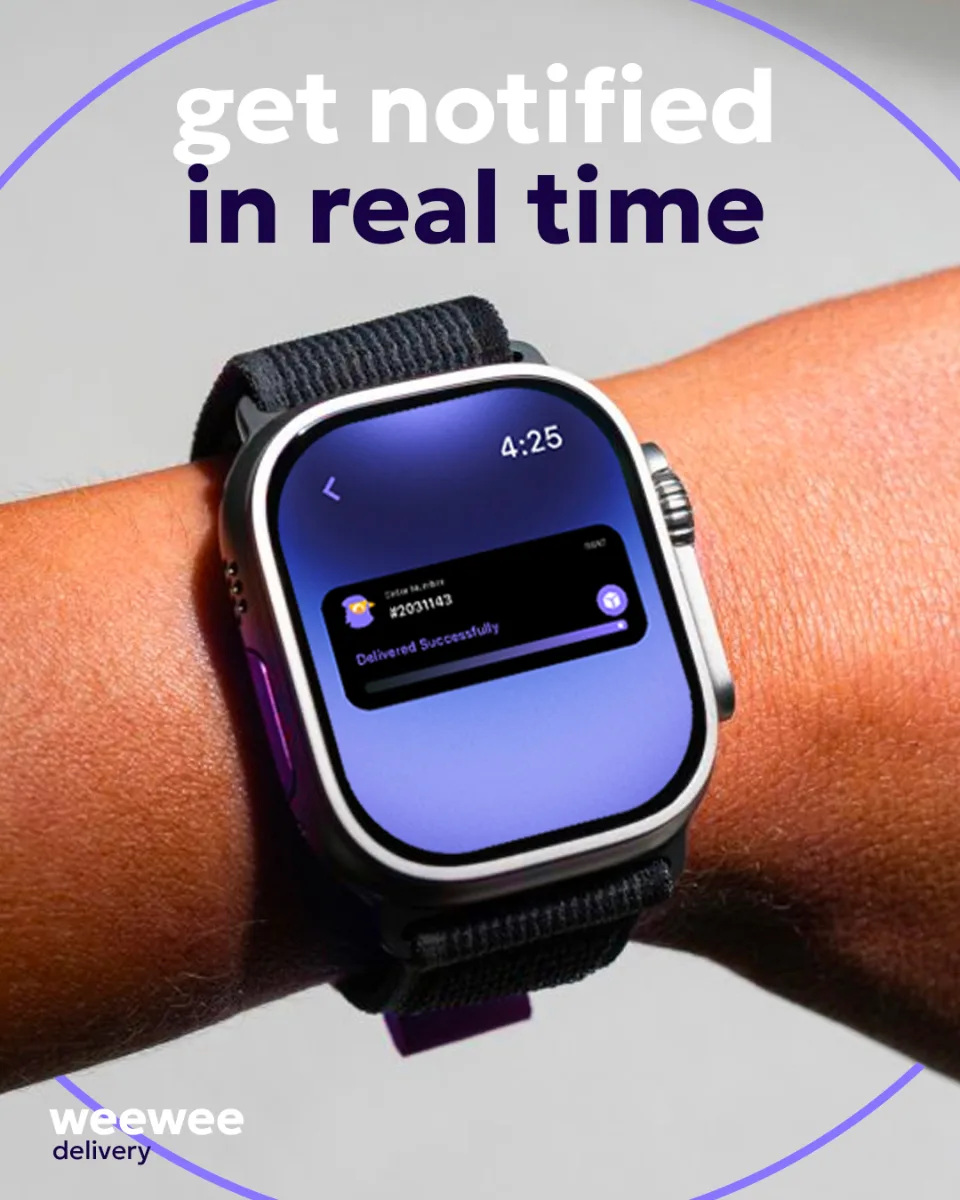
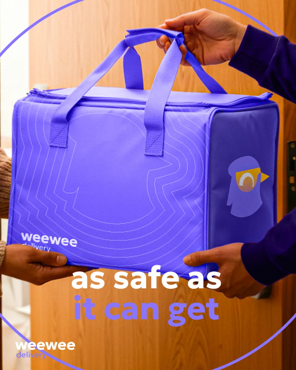
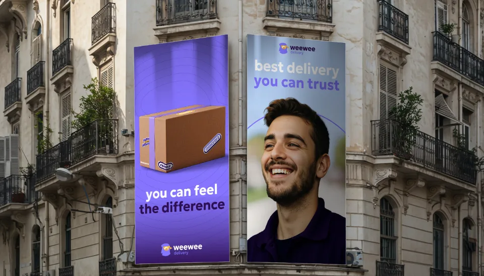
WeeWee is a next-generation delivery service redefining logistics in Algeria through technology, efficiency, and a customer-first approach. More than just a courier company, WeeWee leverages smart logistics solutions to ensure faster, more reliable deliveries while fostering a sustainable future
LogisticsSmart SolutionsServices
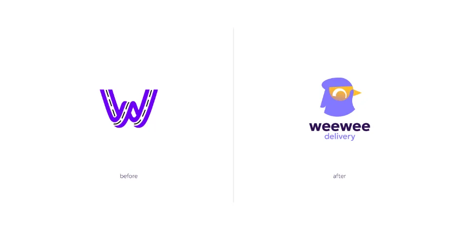
Before & after logo
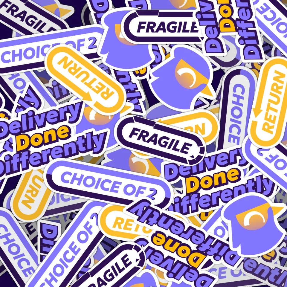
We moved to a mascot identity as the road concept felt generic and limited.
The Maknin (European Goldfinch) adds cultural meaning, symbolizing speed and precision.
It brings emotion and a subtle sustainability narrative.
Most importantly, it makes WeeWee more distinctive and human.
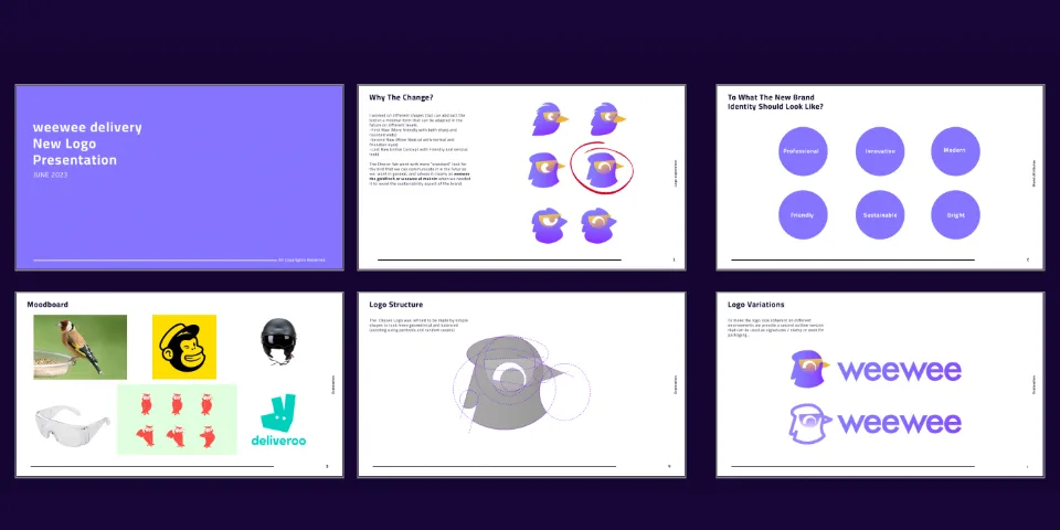
Initial logo explorations
The rebranding process focused on transforming WeeWee from a basic delivery service into a modern, tech-driven logistics brand. By redefining its visual language, mascot, and core messaging, the new identity creates a stronger emotional connection and a future-ready brand presence.
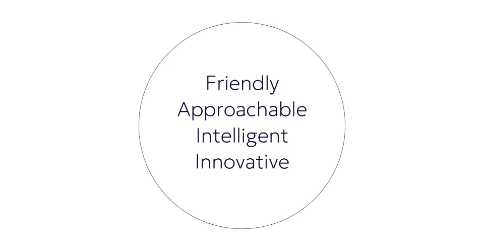
Brand voice
Our brand voice is friendly, approachable, and intelligently innovative. We strive to create a warm and welcoming atmosphere for our customers, showing that we genuinely care about their needs and are always willing to go above and beyond to provide the best service possible.
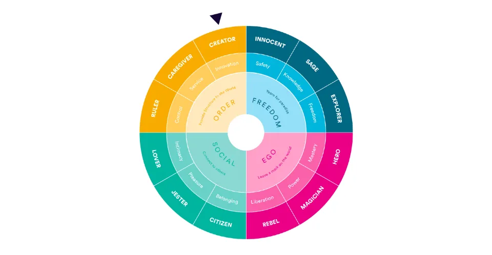
Brand archtype
The Innovator/Creator brand archetype aligns well with WeeWee's focus on innovation and leveraging technology to create a more sustainable and customer-centric delivery experience. The Innovator archetype is characterized by a focus on creativity, imagination, and constantly pushing boundaries to create something new and better.
This project was more than just a rebrand—it was about redefining what a delivery service could stand for. Through strategy, design, and storytelling, WeeWee became more than a name; it became a symbol of trust, innovation, and cultural pride. This transformation sets the stage for a future where logistics isn’t just about speed, but also about meaning and connection.